25/02/13
Today was the day of the first show I am partaking in this term, entitled "Material" and it does plainly what it says on the tin. This exhibition came about from a workshop me and about ten other students partook in last term, this workshop was a textiles based workshop that actually introduced me to the use of a sewing machine as a drawing implement for the first time. All of us are creating work about entirely different things, but what linked all our work up is that the conceptual basis of the work is somewhat personal, and that we are all using some sort of soft material in a piece.
We set up the exhibition in the morning of the 25th, and we held a private view on the Friday of that week.
There was a certain fragility contained in the soft folds and small veins of each of our works, and I found it interesting how everyone involved in this exhibition was female. Will the woman ever escape the stereotype we have been sewn into years and years ago? Will textiles forever be a typically feminine practice? This was an idea we wanted to explore in this show.


The piece I exhibited was my found object piece titled "You Should Look From The Outside In, Instead Of The Inside Out" which is a piece that initially displayed the confinement of the institution. But upon delving into what this piece meant to me, I see a double entendre on the contradictory personality types of Introvert and Extrovert, first penned by Carl Jung. Introversion and Extroversion are classified by about the way you learn and take in information. Jung defined introversion as an "attitude-type characterised by orientation in life through subjective psychic contents" (focus on one's inner psychic activity); and extraversion as "an attitude type characterised by concentration of interest on the external object", (the outside world). It's all about the way in which a person views the world, and I thought this linked in with the physicality of this piece, materialistically made up of an old set of blinds from St. Andrew's Mental Institution, which obviously control what can be seen outside an interior space.
I wanted to transform the physicality of this material, the way it lies and hangs, I took away it's austere constraint and freed it, made it something completely different. And I enjoyed the process of giving this functional object a new occupation. What was once a pair of blinds is now a sun-bleached pile of tentacles, emerging from the wall.
I hope I can make a piece as interesting as this for my next exhibition of BA6.
05/03/13
I have in a way, continued on aspects of BA5 I enjoyed working with and have continued studying St. Andrews Institution yet this time looking at past patients and interpreting them. There is something I really miss about studying portraiture and creating portraits and figurative works. It was what got me into art in the first place after all, and I was good at it. Now I don't do anything like that anymore in my practice. In a way I feel a bit like a sortofcouldbe talent is being wasted.
 |
| William Utting was a patient at St. Andrews Hospital for two years from 1868 to 1870 when he died there. He had fallen from a horse and suffered some head injuries some while earlier his admission and was admitted with epilepsy. Sadly his brain damage seemed to get worse and he died in the hospital. |


"William Utting" 2013, sewing machine embroidery on cotton. Bottom image is top image flipped over to other side.
 |
| "Shaved heads, rave heads" 2013, embroidery on canvas material. |
I still observe an amateur, kitschy look to my practice, which looks like it has been done badly, which in a sense, it has. Like stated above, the only craft I seem to have down to a t is painting and maybe even illustrated, but that is just years of practice, I still have a lot to learn when it comes to my textiles work.
 |
| "Storehouse Magazine"'s promotional poster |
I am still continuing with my responsibilities as the Editor in Chief of NUA's magazine. After being told by the chancellor that last semester's issue was "the best that has been out yet" I have been working away at making the next issue even better. I put this poster up to show that my skills I have learnt on my course are enhancing my professional practice too.
12/03/13
[Notes made in Victoria's "the Authority of the text is provisional" lecture]
I like communication because it is integral to life. We need to talk in order to connect with other humans. In order to make and create more human beings, to keep living in time. Speaking and listening is imperative to survival. Correspondence keeps us a part of the outside world, we learn through the symbolic letters of the verbal.
I like chatting and listening because I like words. No one should ever silence someone. Because that would be to silence life.
13/03/13
Today we visited Firstsite in Colchester. What really struck me about the space itself was it's ubiquitous versatility yet unorthodox architecture which could be seen as limiting. The building curves around in a C shape, causing only one route to walk "down" the gallery, and then you have to just turn around and stroll back up again. There is only one route, which I feel can be limiting, it is abnormal in that sense, unlike other gallery spaces which usually have a cellular grid of rooms that you can weave in and out of. This curvature seemed to manifest itself in my favourite space in the whole building, the auditorium. The canary yellow wall curves in a rotunda, cradling the seated space within. I like auditoriums anyway as spaces, their function interests me, they're a place of arranged silence and communication of thoughts and ideas. I ended up settling on the Auditorium as the space for my piece to work with. As it is a curved wall I have had to respond to the space appropriately, so have decided to project something onto this wall. Here are some observations I made at Firstsite.


 |
The rotunda Auditorium wall  
Other potential areas in the gallery space that intrigued me; stark and bold light casting shadows and angular shapes across the floor, The high up windows that provided the same type of bright light, the two year old, modern building facing the dilapidated, very British and urbanised looking bus station.
|
More musings on what to exhibit at Firstsite, which I have decided I am definitely going to take part in.

17/03/13
relevant visual research
What I want my work to look like
Textures, text, words, reading, language, symbol, figure, psychosis, spaces, psyche, decay, degradation, mould, time, age, HUMAN
Taken from http://pinterest.com/caitlaaan/ba6-research/
TEXT PROJECTION
JENNY HOLZER


Holzer uses text in an almost subliminal way. She also integrates graphic design and advertising into her work, her "truism" pieces are like advertising, except they're selling perspicacity and self-reflection to the viewer. I love this as a mechanism.
BARBARA KRUGER


I especially love this exhibition by Barbara Kruger- the Silent Writings group show in Paris at the Louis Vuitton Cultural Space.
"Words have power whether they’re printed on a page or projected 25 feet high by 14 feet wide. Such is the case with celebrated American artist Barbara Kruger’s text-based installation, part of the Silent Writings group show held at the Louis Vuitton Cultural Space in Paris this past summer." - Boards
The installation, created in collaboration with Brand New School director Ludovic Schorno, features a combination of text and imagery projected on a rotunda that expresses “how we are to one another” — a theme Kruger has revisited time and again throughout her iconic career.
The work is based on short maxims sampled from a gamut of writers, including American author and activist Mary McCarthy and French Enlightenment writer Voltaire. The team at Brand New School animated the text to provide a visual interpretation of each writer’s aphorism, making use of the rotunda’s cyclical effect and huge wall space in the process.
MARTIN CREED
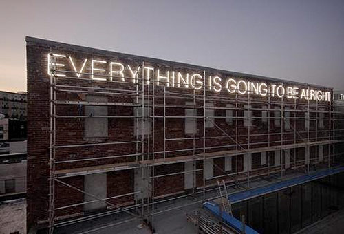 |
| "Everything Is Going To Be Alright", 2009, installation on the Wing Sang building in Chinatown, Vancouver. |
 |
| Martin Creed, "Work No 755", Small Things (2007) |
.jpg) |
"Mothers" by Martin Creed. 21 January – 5 March 2011, Hauser & Wirth London,
Savile Row |
Martin Creed says the work was inspired by his attempt to see the catacombs in Palermo, Italy in just five minutes, but we immediately saw another muse. In Bertolucci's "The Dreamers," Isabelle, Théo and Matthew sprint through the Louvre in a moment of youthful jubilation and rebellion.
Even the way he titles his pieces i.e. "Work No. 850" suggests at his cathartic and productive style of working, he brusquely moves through different medias, concepts and spaces to discover what his real practice is. IVIVA OLENICK
 |
| "Tiger Tooth from Angela Meyer" embroidery and appliqué on fabric |
 |
| "Orange Brooklyn- Running under a creamsicle coloured sky" embroidery and watercolour on fabric, 2013. Text by @EmbroideryPoems |
 |
| "Dad Knows Best" emroidery and watercolour on fabric, 2013. |
The manifestation of text and embroidery in my work is crucial to the centre of my practice at the moment. I love language and words as a form of communication, and working through my ideas with a needle and thread seems to be the most cathartic and successful way for me to work at the moment. So naturally when I discovered American artist Iviva Olenick online I was thrilled to find a practice that seemed so relevant to mine. Above depicts her "Were I So Besotted" project, which she describes as her "embroidering anecdotes from my dating escapades". She states about "Were I So Besotted":
"Each fabric “page” recounts a specific episode. Taken as a whole, these episodes, which combine rawness, vulnerability, humor, hope, fear, disappointment, love and loss, are an embroidered blog. I have named this project “Were I So Besotted,” and have created an actual web log, wereisobesotted.blogspot.com, to post images of embroideries in progress and discuss my process.
While initially I kept a journal where I recorded snippets of conversation, my impressions and thoughts, and made preliminary sketches, now I embroider directly onto fabric, which is usually antique and often has lace edging. In addition, I must admit that my iPhone now serves as a form of a journal: I use the notes feature to record thoughts, which I later embroider.
The act of using embroidery to render text and images requires time, patience and commitment, qualities which seem in contradiction with the fast-paced, casual, and seemingly disposable nature of contemporary courtship as mediated by Facebook, instant messaging, email and text messaging. Similarly, the self-exposing nature of my work parallels the manner in which we expose the details of our private lives via Facebook and Twitter.
My work both exploits and criticizes the intimate-yet-casual nature of technologically-driven socializing. I am looking for quiet and meaning within the noise of information overload. To this end, I thoughtfully construct each embroidery and blog entry, and surrender to the slow, poetic process of my work. The process itself creates a sense of meaning and intimacy."
As an artist who has kept a journal for as long as I can remember and who also uses her phone as a tool for documenting and noting, I am drawn to this artist. Below states what American Art Critic and Pullitzer Prize winning journalist, Jerry Saltz advised Iviva, and what she said in repsonse.

I love the advice he gives her, and the fact Iviva uses Brooklyn as her own studio space, it must be such an inspiring location to draw narrative from. I think I appreciate his advice to her because I should take the advice myself, it seems very relevant to the issues I seem to face during my practice, particularly the point about the problems with scale. I too find I make my stitched pieces too small, last term I only upscaled once.
22/03/13
BA6 Statement Of Intent
BA5 saw me investigating the link
between the psyche and the psyche of a space. Analysing such texts as “The
Freud Reader” and “The Poetics of Space” I discovered a broad new platform on
which to begin the research into my practice. In BA6 I want to expand on this
and delve into the context of the space, particularly the exhibition space and
how I can link that up to the work I am exhibiting.
As for my practice in BA6, I want to continue my use of fabric and the
sewing machine as a means for drawing, and even begin to draw more figures. I
also have begun to integrate more text into my work as writing and language is
a revered area for me personally.
Conceptually, I aim to investigate mental health and psychiatry further,
particularly in the area of psychoanalysis and "the talking cure". I
feel text can integrate coherently into psychoanalysis, as communication and
the spoken word is a key element of such an area. Psychoanalysis and Freud's
"talking cure", contain conversation as an integral concept, so I
would like to investigate the abstract notion of speaking, listening and even
kindness materiastically through the manifestation of text.
31/03/13
I have realised that I want to make art that triggers. What is sub-level in humanity, what has been buried in the level of consciousness that is barely contactable. I want my art to hold up a mirror to the inner workings of someone's mind.
"The subconscious is ceaselessly murmuring, and it is by listening to these murmurs that one hears the truth."
- Gaston Bachelard
I met a random lady in a tea room a couple of weeks ago. She was originally from Queensland in Australia. She had long blonde hair and was in her forties. She was a drama teacher. I had first seen her in the queue for the cakes that sat in their glass incubator. I thought we had annoyed her because we took forever deciding what we wanted to order, and first impressions being what they are, I mistook her confident, solid posture and stoney focused eyes for a stuck-up, I'm-very-important-and-busy-so-hurry-up kind of demeanour.
She first struck up conversation with us about something banal like the tearoom itself, the seating arrangements, the food, the deco, phatic conversation. But before we knew it, more conceptual discourse was occurring. We told her we were Fine Art students, and she asked us what our work was about. A fragile topic for me at the time. She saw my face falling.
"Well, what would you want to make work about? Out of anything in the whole world- what do you love? What makes you angry? What would you change?" She had done it, she had triggered me by niggling into the true source of all my ideas. Things in the world that anger me. Injustice, rudeness, selfishness, global warming. But in this instance, I chose the first thing that came to my head. It was something that had been murmuring in the back of my mind for a while.
"Kindness. And people's lack of it. Compassion too."
It was something that had been affecting me firsthand at the time. I don't know if my drive to create work about such a topic sprang from my own passive aggression or from what I observed about others. It was probably a combination of the two. After all, you can't truly separate your own psyche from your work.
07/04/13
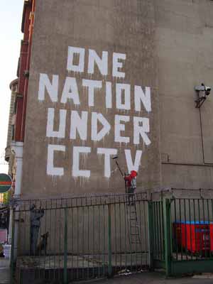
My investigation into the subconscious has lead me to look at subliminal messages, which I feel is an obvious point for me to research, primarily and secondarily, as it combines my enquiry into text and the subconscious. Such subliminal messages I have been looking at are usually ones seen out of the gallery and on the street, through graffiti art or even advertising, as they are exposed to people from all walks of life, as opposed to the Fine Art messages which are only observed and accessible to a certain kind of market.
I am obsessed with the quality of street art that makes people ask questions about their own quality of life, and usually graffiti artists tend to question and probe at the every day person's routines, priorities and morals. They make the audience look at themselves and the country and environment around them.
 |
| "I am free" taken from www.bristol-street-art.co.uk |
BANKSY
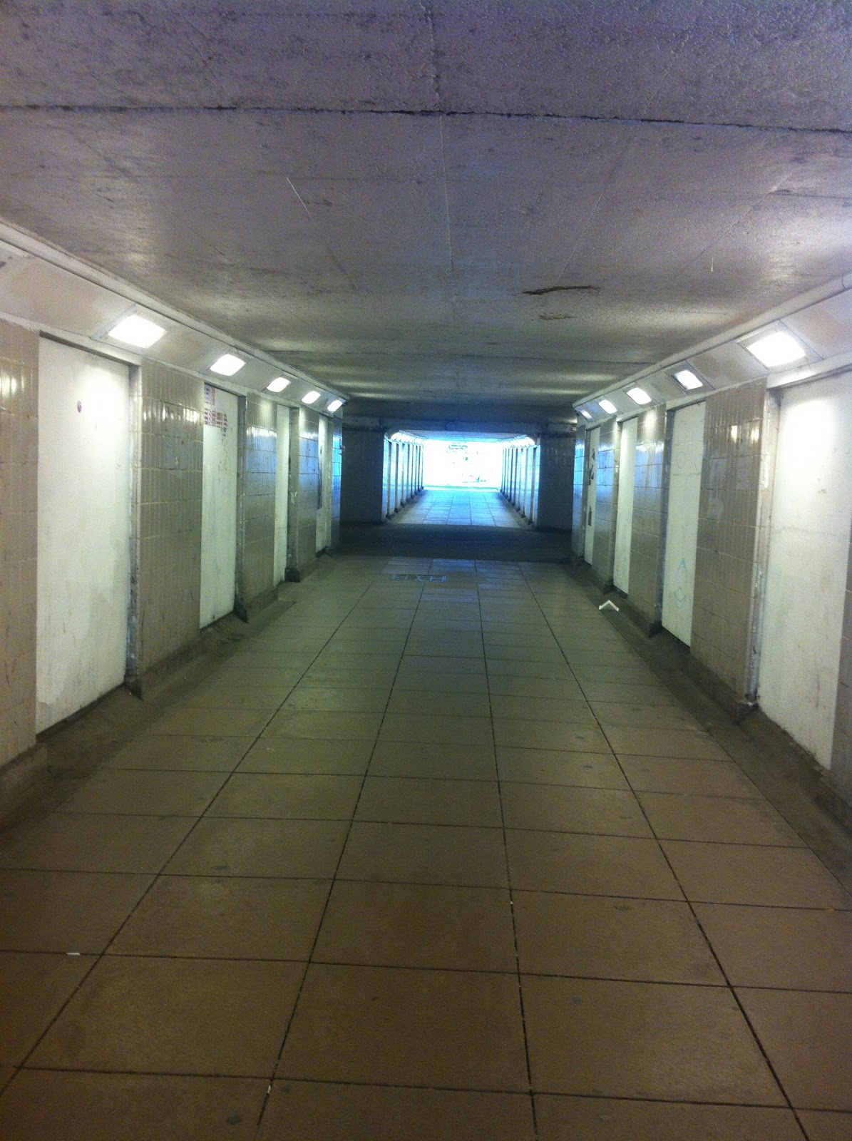
 |
 |
So this week I ventured out into Norwich's network of underpasses in it's ring road system and observed some first hand political graffiti that has the same concerns my research has taken a turn for. A lot of the work seen below is simple textual scrawling, yet the ideology behind it is potent and motivated. The artist encourages free thinking in the viewer here. I aim to make work in response to these messages and "truisms".


 |
| This is my personal favourite bit of graffiti I saw all day, and that is quite simply because I see it every day. I saw it on days when I was down and regretting things I had done, things I had done without thinking. This almost rhetorical question made me ask questions about myself. And it was this notion I found interesting, how can someone I don't even know, who isn't even present, open my mind up like that so instantly? It was like being psychoanalysed by a wall. And this was how I came up with my idea for my exhibition at Firstsite. This piece of insignificant scrawl is profound to me like that, it's almost like I've build up a relationship with it, seeing it regularly, like my confidant. |


12/04/13
I have initiated my first couple of studies of text about the concept of compassion and the subconscious.
 |
| My first investigation into rhetoric and self-analytical questions. Playing with the text materialistically in my sketchbook. |

 |
| More "rhetorical" questions. |


Furthering analysis of the concept of kindness and compassion seen in every day life, I want to know what it is that makes people kind, is it nature or nurture?
I still hold an interest in quotes and statements, particularly poetic ones, so I have elaborated on some verse that I think hold relevance to my practice.
 |
| "Callous" 2013, embroidery on cotton. |
 |
| "Resent/Accept" sewing machine embroidery on cotton. |
In the above I incorporated and transmuted some of the words that intrigued me and put them into material form. I wanted to transpose their harsh and brutally honest realities and soften them, by delicately sewing them onto soft cotton with thin embroidery thread.
I am still highly interested in using rhetorical question in my work however, so intend to continue with this idea with light projection, as I would like to exhibit this concept, and electronically projecting an image seems to suit the temporary, transient nature of the exhibition in the most suitable way.
20/04/13


First trial and error processes with potential texts used for projection for the Firstsite exhibition. I want the text to really hit home, so I have given it an almost newspaper headline quality to it, to add a sense of urgency and severity. In a way, the "Was it worth it?" question could almost be an advertisement or campaign for something to do with physical or psychological health, for example, a domestic violence campaign, and this made me think of the current NHS Mental Health and Time To Change advertisements that seem to on at the moment. I appreciate them naturally, as a supporter of therapy and psychoanalytical therapies.
I then trialled out the images on the projector on the nearest surface I could find- my bedroom wall.


It was hard to tell with this trial how effective the projector is in the context to how I want it to be, firstly the final projected image seemed to be too small, but after a re-shoot outside my house I found out the further away you have the projector the larger the image becomes. I like the way the textures and shapes of the wall it is projected onto manipulates the text and adds more texture. This may be an option for me now, as I have found out I cannot use the exterior auditorium wall at Firstsite, which isn't all a negative outcome, as it means I can use the inside of the auditorium and potentially project onto the chairs or other texture that could add some depth to my text.
 |
| Sketched ideas for new studio work (i.e. top right) and for Exhibition Projection |
I realised that my BA6 needed more discipline. Something that linked it more to the concepts that I am discussing through my work. So I have decided to engage with a practice that has always seemed to be there for me, which is writing, and keeping a journal. But this journal will be different. I intend to record at least one act of kindness every day. I want to document the moments that often get overlooked or ill used in today's world.

24/04/13
Exhibition Day
The nature of this
exhibition was “pop up” as it was only existing for one day, so this meant that
all twenty five of us had to conform to these conditions and create a piece
that reflected our current practice yet wasn’t too complex and intricate to set
up (and possibly even execute in some cases) in one day.
As my work has been
currently text based I decided to go with my current experimentations with
light and text projection and I projected text onto a row of chairs in
Firstsite’s auditorium hall. My piece
lay to the right hand side of the seating area, so to give viewers sitting
access to the video piece being projected on the screen. I shared my exhibition
space in the auditorium with two video artists, who used the large, cinematic
screen.
My current practice has an element of
communication and psychoanalysis in it, so I used the auditorium which is a key
space for speaking, listening and gaining information through communication.

I wanted my piece to hit home with
the viewer, I wanted them to puzzle over it’s meaning and how it can relate to
them. I wanted the reviewer to reflect on themselves and their actions. But as
I realised later on, there was no pronoun directly referring to the user in the
statement I provided. So this meant that directness was somewhat omitted. I
have taken note and intend to find an alternative.

I thoroughly
appreciated people’s feedback on my piece, I find that I shied away from the
criticism but simultaneously asked for it as I appreciate and encourage it as a
key part of an artistic development. Most people enquired as to what “it was
about?” more than anything, and I felt that the message (kindness and thinking
about your actions) I was trying to get across often was mislaid. So I decided
to amend this situation and place a statement I had previously written up
outside the auditorium door, this provided far more context for the viewer. And
excitingly enough, drew more visitors into the auditorium. Given the highly conceptual nature of my work,
I felt it needed this kind of explanation.

As this was another dilemma us artists exhibiting in the auditorium faced, the auditorium entrance was somewhat tucked away, the architecture of the building meant the auditorium sits near the front entrance of the building, and it is visible and obvious to the eye, yet the entrance doors that lead to the inside of the auditorium are quite difficult and unobvious for the visitor to locate.

Something we realised
for next time is that we may want to signpost the location of an exhibition
space more effectively. I.e. put up signs stating location of artwork.
The nature of this
exhibition meant that organisation was somewhat slapdash, especially with
Firstsite’s curators themselves, but we discovered later on in our group
meeting at the end of the day, that this almost last minute attitude was to
provide openness and flexibility to the artists involved. The Firstsite team were incredibly helpful
like this, they would stand back from the artist’s setting up, but if you
needed a hand with anything to do with the arranging of the work they would
jump into action. This sort of approach displayed by the Firstsite team irked
some of the students I worked with on the exhibition, they found the approach
too unorganised and stressful, but in my opinion this is the reality of
exhibiting in a professional gallery space environment, what you need does not
just come to you, you have to go seek it out yourself.
I also
underestimated the whole experience of invigilating our exhibition space; I
imagined we would all take it in turns to watch over our work (just in case).
But in the end it was not necessary, my laptop was securely latched onto a pole
in the far corner of the room, and the two other students who exhibited videos
had their laptops locked in the projection room at the top of the
auditorium.
It also raised the
question to me of what the artist does when their exhibition is all set up and
being viewed by visitors, where does one go? What does one do? Is there a green
room the artists just disappear into in a secret corridor in the gallery? I
watched my piece as the day went by, staying on the gallery site at all times.
But other artists wandered off into town. Some did stay at Firstsite though; I
found it interesting watching everyone’s different mannerisms towards their
work. Some students stood next to their work proudly and “chatted up”
interested viewers, even handing out business cards. Yet on the other end of
the spectrum, some of the artists seemed to clear the whole area of the work. I
stood watch over mine most of the day, as I was facing technical difficulties
with my piece’s functioning anyway.

Although these security measures were implemented, I still had to keep a watchful eye on my own equipment, which was proving to be temperamental. At the time I had forgotten to take my MacBook off it’s “energy save” settings, and about after an hour of it being plugged into the projector, it would go to sleep, thus turning off the projection. I had tested the projector out beforehand, but not for that length of time. So in the next instance of me using a projector, I aim to test it out in the same conditions (although it was hard in this case, as obviously I couldn’t assess the art work in it’s gallery space, as it’s a working gallery space that is frequently used and I was only exhibiting for one day). But next time I intend to test-drive the work out to the best of my ability and circumstances before the final show.
One of my other
personal concerns for the aesthetics of my work was that it was simply too
small, I found that with working with the projector the further away you placed
it from a surface the larger it would grow in scale. Next time I aspire to
experiment on a larger scale, as I reckon that gives the piece more impact. The
somewhat small scale and cornered positioning gave the work more of a twee sort
of feel. Which is not what I was going for, I wanted the text to be like a
brutal and obvious headline, the letters yelling “truisms” at the viewer. As
previously stated, making the spectator read it in relation to their life and
psyche.
“Was it Worth it?”
succeeded however in the light manipulation of the text through the physical
alteration it experienced by “dripping” down the seats, and this look changed
depending on which angle the viewer looked at the work. Visitors and colleagues
of this exhibition commented on this effect and appreciated it.
There was also an
interactive quality my work held, metaphorically and physically. Metaphorically
my work sits among the viewers in the audience, and this is contradictory to
the “traditional” gallery set up rules of no physical touching of the work
displayed. I enjoyed watching people experience the work by walking through it
and in front of the projector.
As a matter of
fact, the entire Firstsite show we curated was indeed rather interactive in
general. I think my fellow students and I contemplated the audience and market seen
at Firstsite gallery successfully in this sense. From our research we gathered
that Firstsite’s mission as a gallery space is to make contemporary art
relevant and accessible to all types of people of all ages. Firstsite’s
distinctive morals like this are what made me decide to exhibit there in the
first place. They want art to be less exclusive and “elite”.
This interactive
aspect of our exhibition definitely appealed to children, seen especially in
Francesca Cant’s piece, “White Wooden Blocks”, which encourages people to play
and physically experience the object.

Figure 4"White
Wooden Blocks" being arranged and handled by students.
Unfortunately, our
exhibition was only on for one day on a Wednesday so only very young children
who weren’t in school yet could attend our exhibition. Older audiences en route
to the gallery café (a popular hang out spot) got to experience the work
however, and some pieces caught the passer-by’s attentions.
The group of
students exhibiting at this show was large, there were at least 19 of us, and
the vast diversity between works and the space was a concern before the day of
our show. The compartmentalising seen with the different rooms in the space
offered us some relevance between our works however, for example, the
auditorium displayed correlation in between all our pieces. And I noticed the
coherence also in Learning Space A, which contained certain green, black, grey
colour coordination.

Figure 5 Hannah's
turf piece that leads into Learning Room A, the lush green shades conforming
fluidly with the colours coordinated in that space.
What interested me about my personal experience of the day
we spent exhibiting at Firstsite was how ultimately quite nerve-racking and new
it all was. I strode into the day confidently, thinking of my past experiences
curating and displaying my work, my magazine editorial work, and my own job as
a sales assistant. I thought of the diverse mixture of people I have worked
with, and my own inter personal skills. Truthfully, the exertion of working in
a professional gallery environment, exhibiting your work next to industry
professionals (Richard Hughes, for example) did not sink in properly until I
arrived at the gallery, and found myself standing awkwardly and trepidly in the
“green room”.
All in all, I
learnt a lot, especially regarding ideologies surrounding professional artistic
practice such as where the artist is located during the exhibition, and how to
successfully bring what has been crafted in the studio or at home to a
professional working environment. Health and safety was something to consider
in this department, especially for when artists had cables and trippable
materials laying in public walkways.
Firstsite was a
great organisation and space to work with as well, the staff were enthusiastic
to help and the space itself left a vast amount of room for creative
adaptation. Firstsite has a more free approach to curating than other gallery
spaces I have exhibited with, they are more open to different styles of
curating and art placement, unlike many other galleries i.e. Tate which follow
a strictly traditional, white-cube-esque gallery protocol. Firstsite allowed us
to truly “push out the boundaries” and get inventive with displaying.
But above all
things, the most enriching aspect of the exhibition at Firstsite was getting
other’s opinions on my art, and hearing the questions I ask myself about my
work being asked to me by an external voice. This is the area I feel I gained
knowledge in; it made me ask new questions about where my artistic practice is
going.
Two weeks of kindness


06/05/13
With these diary entries I started interpreting them and picking out my conclusions and the aspects of peoples kindness that I found most interesting, or quite simply, my favourite entries.
I have realised that I like my work to have the concept and the sort of aesthetic that simultaneously cohabits with the concept and looks good. In a way, I would like my work to tell a story, a personal story, and look so aesthetically pleasing that viewers may even want to purchase it.
I just think that if the public "like" the way an artwork looks they can relate to it more. I think of people like Tracey Emin and Chris Ofili who deal with their own identity in their practice yet don't estrange the viewer from what they're trying to say. Nowadays the public is sadly, distant from some artworks, particularly ones that are just objects in themselves and highly conceptual, they are simply too detatched. So maybe there is an element of design in successful art? I definitely see an element of design in my current practice. If a piece pleases the eye, it is generally more accessible. Particularly to the untrained eye. And I want my work to be read by all and not to be disillusioning.


I definitely prefer my sewn diary works and just the diary works in general to my exhibition piece, as I have realised why I don't like it. It is far too extroverted. It is too much about a wider public, as opposed to my stance on matters as an artist. It is also the aesthetic of the piece, the font is too clean, too sterile. It is not raw enough. And it is no way big enough either.
I sadly feel a lack of ownership to the work I have made before the kindness diary. They feel emotionally estranged to me.
I definitely lack a certain decaying materiality that my work usually contains, there is usually an ageing viscerality attached to my work through use of bleeding, dripping, tearing, shredding destruction. I feel as though there is a big omission in BA6. But I have started bringing that quality back in.
I realised how much I missed this aesthetic quality to my work when I stumbled upon this old book on Psychoanalysis, dated from 1948. I intend to use it as much next sketchbook.
My next artistic endeavour will be based on something that egocentrically inspires me. I can't wait to make work that is more autobiographical, a topic that I have been running away from for so long. And this explains my erratic switching of media and concepts.


However I hold no regrets for choosing a concept such as kindness. It provided interesting ammunition for my practice and my own opinions. It also triggered me to look more at diary and journal writing as a platform in which to make art, and this is something I am now going to pursue come this summer/next academic year.
CHRISTIE MALRY'S OWN DOUBLE ENTRY
“We fondly believe that there is going to be a reckoning, a day upon which all injustices are evened out….But we shall die untidily, when we did not properly expect it, in a mess, most things unresolved, unreckoned, reflecting that it is all chaos. Even if we understand that all is chaos, the understanding itself represents a denial of chaos, and must therefore be an illusion”
| — |
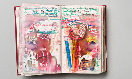
DIETER ROTH
"The dark undertone and furious, obsessive energy of his work ultimately separated him from many of the more lighthearted Fluxus artists. Perhaps despite himself, he was a fluent draftsman and expert printmaker, and his drawings and prints contained his wild energy within peculiarly virtuosic forms. Compared to the innumerable self-described artists of the last several decades who faked their way through his sort of work, Mr. Roth was the genuine item" -Wikipedia
"Insel" 1968. Mixed Media. (Notably, rotting foodstuffs)
"Throughout his life, Roth kept a diary: a space to record appointments, addresses, lists and deadlines but also ideas, drawings, photographs and poems. His diaries teem with graphic exuberance and proved a rich source for his work." -Fruitmarket.co.uk


An exhibition at the Photographers Gallery in London was relevant to the book as an object to sum up a practice in the gallery. Adam Broomberg and Oliver Chanarin published "War Primer 2" a limited edition book that physically inhabits the pages of Bertold Brechts "War Primer" that came out in 1955. Broomberg and Chanarin layered pictures of war from google images over the already existing images in Brecht's book to create a new narrative of modern war stories.


No comments:
Post a Comment